Category: Assignment 3 – Final Review – Module 3-5 Blog Posts and Comments

Creating Effective and Accessible Multimedia for Education

This week we were asked to question the way multimedia is designed and try to discern if the design choices generally made consider all the forms that human beings come in. My cursory thoughts were enough to reveal that I have to make more of a concerted effort in this department – historically when I have produced any piece of content it hasn’t struck me to make major considerations as to the accessibility of it – and this is something that I plan to change going forward.

What does inclusive design mean to me?

Prior to this week I would have said inclusive design is when tools are made to consider people of all abilities, but now I think inclusive design is the when product/project planning considers people. This distinction may seem minor, but I think it can have major implications for myself going forward. No longer will I see inclusive design as a decision about implementing accessibility features after the piece of content is created, but rather I will be starting with a mindset that anticipates these needs and thus be able to adapt design accordingly.

In the past few weeks I had been emboldening headings, which wasn’t inclusive of people suffering from visual impairments, but going forward I have decided to use actual headers so the difference between the body of the text and the headers themselves if sizeable. Further, I will stick to plain text as much as possible, and limit myself to not using atypical fonts, as these can cause issues for text to speech reading tools.

I know these ideas I have mentioned don’t really embody the ethos of the statement I have made, I think making that change will take time – but I do think it is a step in the right direction.

Using Text to Speech Tools

I had never gone out of my way to use a text to speech tool before, and my experiences with it today have been enough for me to consider using them going forward.

I have a difficult time reading long passages of text and extracting something meaningful from them – conversely, it is much easier for me to focus on the message of the text when it is read aloud to me. In specific, this happens for me in the setting of reading long pieces of academic styled text. So I tried out a tool on one of my textbooks and the difference it made in my retention of the information was massive. I found my experience directly tied in with the “Solve for One, Extend to Many”, aspect of accessibility consideration that Mary went over in her blog post.

The tool that I used – Read Aloud – was free so I can’t be too harsh of a critic on it. I am also trying not to have my experiences with this one tool be reflective of my opinion of all text to speech tools – with that said, there are definite areas of improvement required. Namely for me, having a voice that sounds more natural and less robotic would be a large overall improvement of the experience. Again, this is likely due to the extension being free, but I reckon that we should support this technology to the point where natural, human sounding voices, aren’t held down by licensing fees so a corporation can profit off of it.

Going forward I think this experience will actually change the way I write my posts. I will try to be more mindful of how a text to speech reader will interact with them. I already mentioned earlier that I will use generic and plain text as much as possible, but another thing to consider for my blog posts will be formatting. When I was using Read Aloud I found myself having to interact with the tool to have to skip sections of text due to formatting reasons, and this is what helped bring me to this revelation. I think everyone in general, not just educators, should try accessibility tools themselves to not only see if they could be helpful for them, but also to glean a better understanding of how to consider peoples who use these tools daily.

Wave Accessibility Check

For me, in the perspective me designing a website or writing a blog post, I found this tool to be slightly disappointing. I do like the idea of it, but I think in its current form it only really pointed out what was blatantly obvious. I would imagine most people running this tool would already know to consider many of the recommendations this tool has come up with – I think I just expected it to offer more. Regardless of that, it is still a valuable tool – it is almost as if it were spell check for creating content with people in mind. (You could also say I was hoping for this tool to be more of a Grammarly than a spell check.)

When I used WAVE on my blog posts I found that most of the issues it went into were with the design of the website rather than the posts itself. So the consideration I would make going forward would be with the overall design of the website rather than producing snippets of content on the website itself. Figure 1 shows this well. However, when there were issues with the content of the blog post itself, it was due to the there being a presence of some sort of multimedia- this is shown well by Figure 2.

Going forward I do think this tool will be valuable for me to use despite my disappointment with it. I think being reminded to correct your spelling is not a reason to be disappointed by the tool not offering to fix your grammatical issues as well – the same can be said about the WAVE tool with respect to it reminding you to consider the basics of the accessibility of your content.

Figure 1:
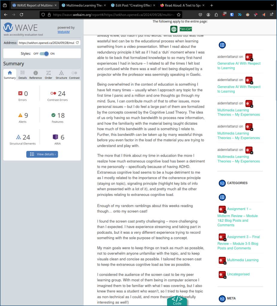
ALT TEXT - Figure 1 shows no errors or alerts given by WAVE on the body of the blogpost, but there being a large variety of issues with menus on the website - issues with contrast, structure, and design.

Figure 1 – This image shows how most of the errors the WAVE accessibility tool found were to do with the layout of blog post’s website, rather than with the content of the blog post itself.

Figure 2:
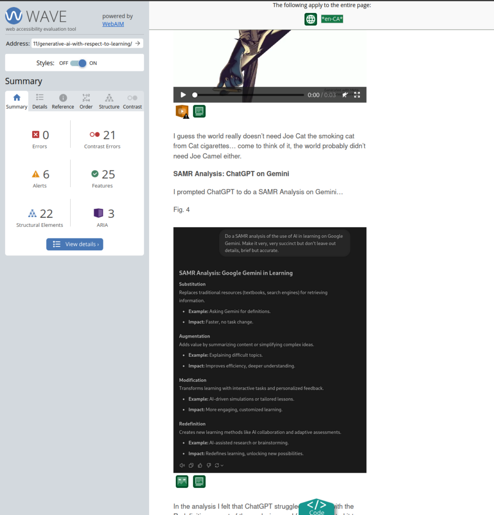
ALT TEXT - Figure 2 shows errors on the blog posts contents, specifically when multimedia is present. In the image you can see that when there is a video and image present, the tool reminds the author to make sure there is a figure and alt text present that explains the multimedia.

Figure 2 – This image shows errors on the blog posts contents.

Canva Infographic

For my infographic I chose to make it on effective study habits! The reason why I chose this is simply because I had trouble figuring out what to make it on, and when I saw this template on canva it just screamed out to me to make it about effective study habits!

How I kept design principles in mind for my infographic…

Hierarchy: Each tip is numbered – it follows an order and lets the reader follow it intuitively. The titles are also emboldened to further help with this.

Contrast: I chose the text to be black, and the background to be an off-white. I also highlighted the headings for each tip.

Repetition: I kept the same format for each tip.

White Space: Kept information condense to be able to maximize white space.

Alignment: Canva makes it really easy to align objects off of other objects! Kept tips aligned against themself.

Balance: The alternating text/image pattern helps visually balance the infographic.

Figure 3:
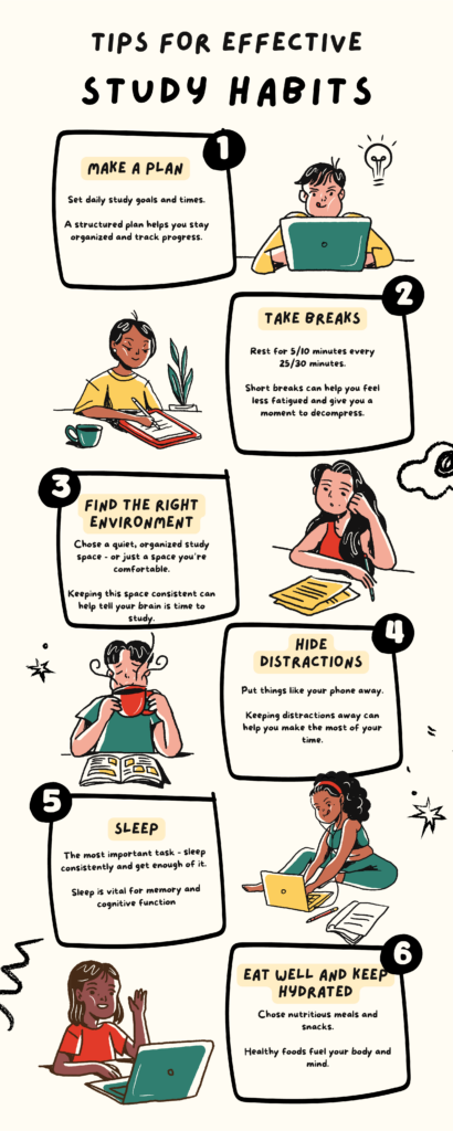
Tips for Effective Study Habits

1) Make A Plan
2) Take Breaks
3) Find the Right Environment
4) Hide Distractions
5) Sleep
6) Eat Well and Keep Hydrated

Figure 3 – Canva infographic showing study tips

I’m really glad to have been introduced to a tool like canva. I am absolutely horrible at making infographics and from my glance at the website it will help make my presentations more visually appealing as well. I think a lot of the templates on the websites have many of these design philosophies we have talked about baked in already, so it will keep it a bit easier for me to make useful multimedia without explicitly remembering everything that would go into design choices.

Closing Question

How has a technology/tool that was originally made for one helped you as one of the many (with respect to the tool)? If one of these accessibility tools were made with you in mind, how much have they helped with your interactions with education?

I’m curious to hear about your experiences!
Learning Design and Active Learning

I came into this module a bag of mixed emotions – learning design terrified me for some reason… I kept thinking to myself, “oh jeez, I’m terrible at planning ahead,” and wasn’t ready for the pain train, expressly created for my downfall, that was waiting on the other end of station. Despite how badly I was shaking in my boots, I decided to board the train and some interesting revelations came about. These are those revelations…

I don’t suck at planning.

I just suck at writing things down. I love to think, but I can’t find it in me to remember to write these thoughts down. Endlessly I will be in my head trying to approach a problem, or a task, creatively – but for some reason, I don’t take a few moments to jot down these moments of constructive thought. Now you might be wondering, what does this have to do with you thinking you suck at planning? Well, in this week’s module when we were covering constructive alignment and backward design I found myself feeling this is just one of the ways I naturally approach system design/analysis in general – be it about an educational framework or not.

It makes plain sense to care about harmony between the end goal, measurements of this goal, and the ways you work towards this goal – in the context of education it would be known as the intended learning outcomes, assessments, and learning activities. They must work together for the outcome to be reached. Naturally, when you outline yourself a goal, to make sure you hit that goal, you come up with a way to measure your progress. Taking it one step further, you would devise a plan based on hitting those markers of success… in essence, you would find yourself doing backwards design and innately create this desired harmony.

All of this to say – I don’t suck at planning, I just suck at writing things down… but at least that is a much easier thing to fix.

We are building robots.

Throughout this past week, I found myself in a few lengthy conversations with interviewers and professors where we discussed the ability and competency of the average computer science student looking for internship opportunities as a developer of some sort. It seems that many of my peers weren’t learning how to apply the concepts we had been interacting with in our degree – but most of them did become extremely adept at regurgitating them.


When you start a CSC degree usually you do so by learning the basic fundamental concepts surrounding programming through learning a programming language – at some point though, you abstract away from using any programming language in particular and just talk about the tools that most of these languages offer in a high-level way. With this abstract way of viewing programming design, you open yourself up to learning about famous algorithms and data structures that are vital frameworks for solving extremely complex problems. The idea is that you can then take these frameworks and find problems in the real world that would fit into these frameworks. You would apply these frameworks. In reality, it seems that we have just made robots that can spit out these frameworks but never truly apply them.


Why? I think it has to do with a poorly designed learning system that has been created by the pressures of the industry’s accepted interviewing practices as well as how assessment of this knowledge is measured at the school level. Students are incentivized to learn these algorithms and data structures in a sanitized cookie-cutter environment (such as LeetCode) as that is the environment they will be asked to demonstrate these skills in an interview, and in school students are tested for their memorization of these algorithms/data structures rather than being asked to/instructed to try and apply these concepts to a real problem.

The solution? We need change from within the industry, and from school as well.

In school, we need a restructuring of the learning design surrounding this topic. We need to rethink what the learning outcomes of this topic are, how we can assess them, and how we can teach students with those assessments in mind – put plainly, we need to care about students abstracting these topics rather than just repeating them. We need to care about students actively interacting with this topic to the point that they also are engaged in solving real-world problems (one of Merrill’s Five Principles of Instruction).

On the industry side of things, we should probably step away from only caring about this one small topic that students learn in university. A developer’s job is not about spitting out algorithms and data structures from memory – it’s about being a dynamic problem solver who can cobble together information from multiple different sources to reach an amicable solution to the problem – perhaps working on problems that mimic the work environment in an interview would lead to incentivizing applicants to train to become better at the job they are interviewing for.

Andrea was right.

Before I started reading this week’s module, I took a look at Andrea Torre’s blog post on it – she mentioned how evident scaffolding was in elementary school and she was not wrong.

Take math for example – when we learned how to count, add things, and subtract things we were initially given physical objects to interact with. We were able to create meaning towards concepts through physical interactions. As time went on, we began to use images of these objects… we would be shown 5 apples and then be asked to cross out 3 apples. Eventually, it leads to abstract thinking about these concepts through a story… Jill has 20 apples and Bob has 10 oranges, Bob gives 5 oranges for every apple Jill offers him, how many apples can Bob get, and how many apples will Jill have left over? And then at some point, you find yourself in university doing integration and differentiation without the need for this scaffolding that helped connect the real world around you with this abstract concept of numbers.

I never really put much thought into how I was taught mathematical concepts, but it is evident looking back at it that ‘scaffolding’ played a monumental role.

A Sample Lesson Designs

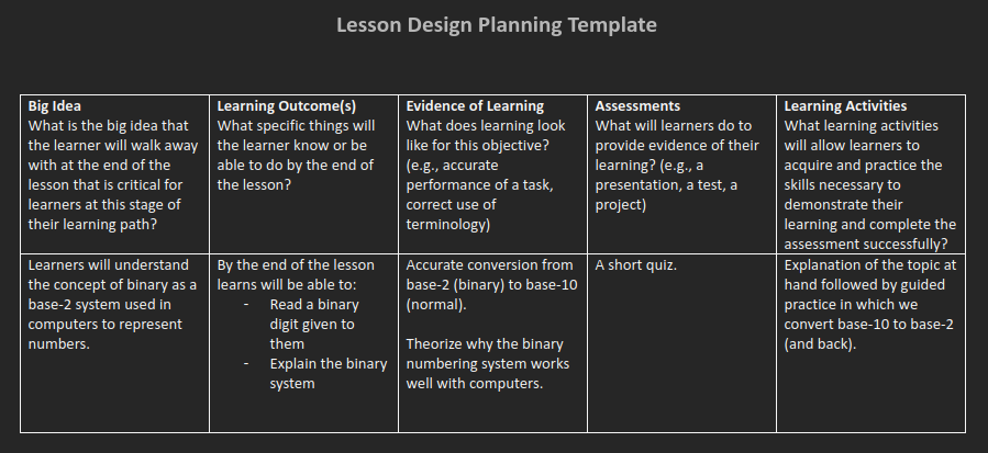
To add some context, I thought about how I would go about teaching a short lab on the binary counting system. I found it particularly difficult to really nail down specific learning activities – honestly I think my currently chosen learning activities are lackluster and require more thought and refinement.

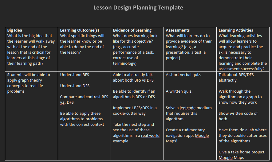
I also made another sample lesson plan and it was made with the idea of trying to revisit the lesson design plan surrounding data structures and algorithms. I complained earlier in this post about how the current learning design wasn’t so great, so I thought maybe I should try to fix it myself! I did so by trying to think about how students should be taught BFS/DFS algorithms… truth be told my end plan didn’t differ much from how it is currently done in school. Looks like I can just spot the problem with the current learning design plan without offering a decent solution at this moment.

H5P Content Creation

I wanted to make a multiple choice widget that people reading this blog could interact with, so I decided on making it about something I discussed earlier.

I tried to make all the answers sound correct enough if read haphazardly in order to get everyone re-reading the questions again, and to think back to earlier with a little bit more effort.

Further I wanted to create a matching game, something I would imagine children would use that are learning colours!


Can you guess where the images of the fruits came from? It has something to do with the module last week! I also took the opportunity to shout out channel Orange by Frank Ocean but using the album cover as the colour option in this game. Credits have been given to each image used under Rights of Use in the H5P tool.

Closing Question

Earlier I ranted about computer science education and its failings with learning design – can you give an example how the learning design of a course has failed you?

© 2024 Markus' EDCI Blog

Theme by Anders NorenUp ↑